Fund Texas Choice CRM
Non-profit CRM that organizes a database of volunteers, events and donations at a glance
Overview
Role: UX/UI Designer and Researcher
Duration: 2 Weeks
Tools: Figma
About Fund Texas Choice
Fund Texas Choice is a non-profit organization helps Texans equitably access abortion through safe, confidential, and comprehensive travel services and practical support.
Project Background
Fund Texas Choice needs a responsive CRM to manage and organize their database of volunteers, events and donations to help them view and understand information at a glance.
The employees at Fund Texas Choice need a more efficient system to track all of their information regarding their volunteers, events and donations in one place.
The Challenge

Too Many Options
There are many CRM systems that exist and Fund Texas Choice has unique needs. The non-profit will continue to grow and will need a flexible platform to keep up with their growth.

Volunteer Coordination
Fund Texas Choice needs a quick way to mass reach out to volunteers before fundraising events (etc.) and keep track of which events still need or have enough volunteers.

Tracking Progress
Fund Texas Choice organizes across multiple cities across Texas. Having a platform that links all cities together and keeps track of the organizations fundraising progress is a must!
Metric Goals

Fundraising
Increase fundraised amount using the new organized platform and data tracking

Volunteers
Increase volume volunteer participation & outreach with convenience

Organize
Organize all aspects of the company into one easy-to-manage platform

Outreach
Increase nonprofit reach to even more Texans
Solution
Design a CRM platform that helps users to:
Quickly visualize current stats, goals and upcoming fundraisers. Users can customize their dashboards using widgets so that they can visualize their specific relative stats and goals.
Easily notice what tasks need to be completed urgently before upcoming events. This platform can help users know which tasks to focus on immediately to accomplish long term goals.
Increase outreach to volunteers all over Texas. Oftentimes different areas within Texas can be overlooked but an organized platform can make it easy to connect all parts of Texas and encourage participation.

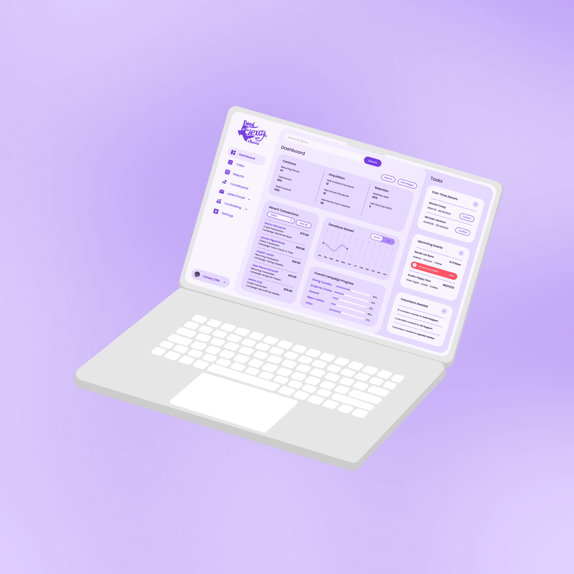
Flexible Dashboard
Users need a place to start. This customizable dashboard is designed to allow users to view their progress, upcoming and immediate tasks at-a-glance.
Task Bar
The task bar is an allocated area on every user’s dashboard that can be populated with each users’ specified tasks. Users can then immediately navigate to and track whatever page they need.


Notification Tags
In order to draw users’ attention to tasks that need immediate attention, users and their managers can flag time sensitive tasks that are marked with attention grabbing colors such as red, green or yellow.
Project Kickoff
There are currently many Customer Relationship Managment (CRM) Systems available for nonprofits, however, all nonprofits are structured differently and require a unique system to cater to their needs. Fund Texas Choice needs a responsive CRM to manage and organize their database of volunteers, events and donations to help them view and understand information at a glance.
What I need to know:
Identify the motivations for the nonprofit to influence the workflow of the CRM.
Identify specific nonprofit daily tasks that might influence the content on CRM dashboard.
Understand how users currently fundraise and campaign for Fund Texas Choice nonprofit.
Research
User Interview Questions
I began my research by conducting user interviews with 4 participants: 2 participants who have worked at a nonprofit organization before and 2 participants who use a CRM system daily. Some questions I asked include:
How do the motivations of a non-profit influence the workflow of a CRM?
How do participants use a CRM on a daily basis?
How did participants fundraise and campaign for their nonprofits?
Insights from Users

Emphasis on Fundraising: Much time is spent communicating with old and new donors and creating events to encourage others to donate.
Visualize Data: Users like to quickly see collected information on a higher level to understand if the non-profit is meeting its goals.
Specified Tasks List: This is important for each user to see their own specific list of tasks on their dashboard to help them prioritize their work for the day.
Coordination is Key: The CRM would need a database showing the relationship of the employee, volunteer, donor and campaigns.
Learning from the Competition
I conducted a competitive analysis of other CRM systems for nonprofits to identify their strengths and weaknesses.

Building Empathy
Provisional personas were created to better visualize target user group archetypes and their needs. I created 4 employee/volunteer archetypes.

Persona
This persona was made to help me visualize what a Fund Texas Choice nonprofit employee would want in a CRM.

Information Architecture
Site Map
Using the information collected from the user interviews and competitive analysis, I created a site map to organize the flow of Fund Texas Choice’s new CRM.

I created a user journey following Canary’s Persona.
Canary, an employee of Fund Texas Choice, logs in to begin her work day. She checks her dashboard to see what to focus on for the day. Tasks widgets shows the most pressing matter is in the “Upcoming Meetings/Events” widget, so she clicks on this to see what the pressing task is. The flow then follows 2 tasks:
First, sending out a reminder email of the upcoming event to the invited volunteer who has not RSVP’d
Second, selecting an additional Volunteer to help as Event Support.

Testing User Flows
With the help of the user journey, I laid out a dashboard with references to some information I saw on the Fund Texas Choice website. The goal of this flow was to visualize Canary’s journey through completing her task and ensuring the process is visually straight forward.

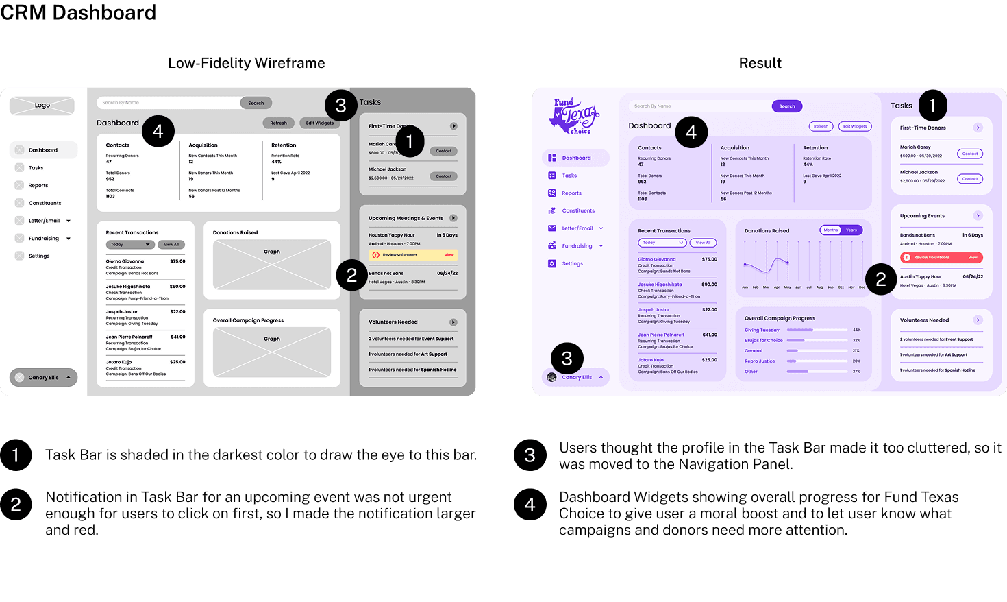
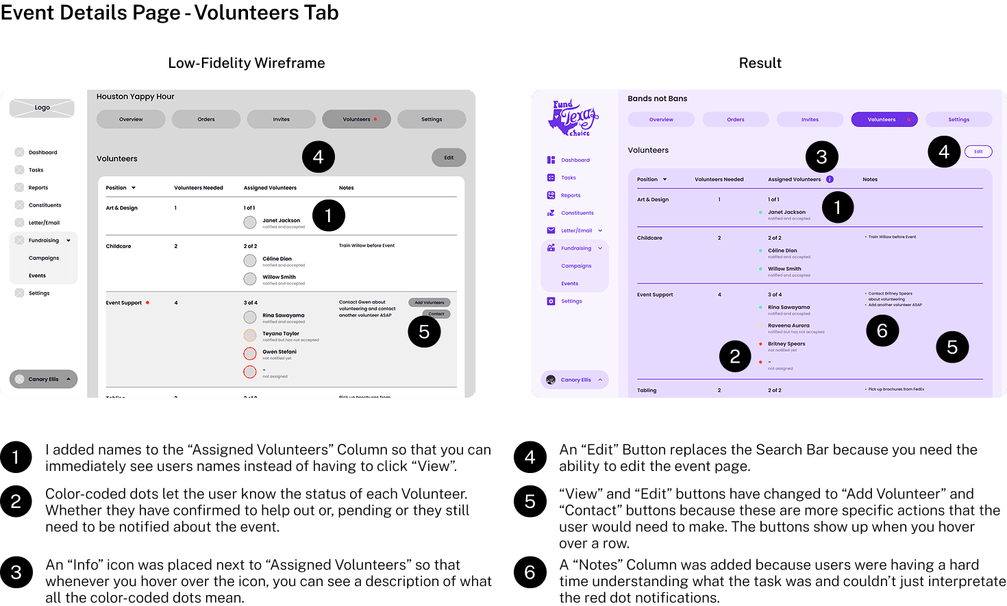
Low-Fi to High-Fi Wireframes
Based on the site map, competitive analysis, user interviews, and user flow, I created a series of low-fi wireframes. After a couple rounds of feedback and iteration, I developed the wireframes into a final product to test.
CRM Dashboard
Events Page

Event Details Page - Overview Tab

Event Details Page - Volunteers Tab
Visual Identity
The color pallet was developed from Fund Texas Choice’s purple logo. This color is used throughout their current website and was paired with a stark white. I felt that the purple/white combination was a bit too harsh and I wanted the CRM to look pleasant and soft, so I used shades of the main purple to create shape and depth.

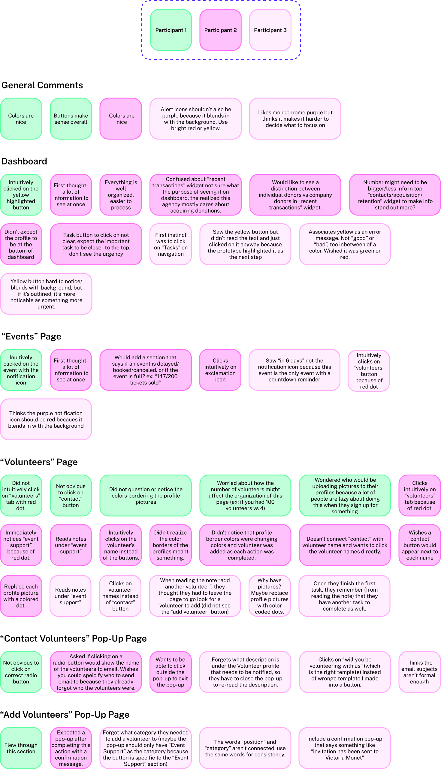
Iterating and Testing
A high-fidelity prototype was put through user testing to assess the following:
Overall ease of navigation and user understanding of the website
Observe user interactions and identify pain points where users had the most difficulty
Ease and efficiency of completing tasks
Determine if the CRM successfully organizes information
3 Participants aided in providing a lot of useful feedback on how to make the navigation smoother. Below is the affinity map of success and many hiccups for each main page of the Fund Texas Choice CRM.
A common thought that was brought up through user testing was the fact that users had trouble knowing what to focus on when navigating through the CRM. While the monotone purple color us fun, the amount of color purple drowns out alert colors such as red, yellow and green.
Final Prototype
The wireframes were further refined into a high-fidelity prototype made with users of varying design skill-levels in mind.
Next Steps
While most of the comments were addressed within the prototype, many issues would require figuring out the complexities and details outside the scope of this project. If I had more time, I’d focus my efforts on linking various branches of the CRM together. The CRM is all about collaboration and coordination and I have only scraped the surface of this design.
Additionally, I think it would be amazing to actually work with Fund Texas Choice. I fully believe in their mission and I would love to do anything to help them be more organized and work more efficiently.