Overview
Client: Benjamin Goldberg
Role: UX/UI Designer, Researcher, Visual Designer and Brand Designer
Tools: Figma
Project Background
RankPic is a Photo Ranking App that is designed to help you find your best photo and help others find theirs! RankPic helps you find your best photo by crowdsourcing feedback from anonymous users. I gave the app a new identity through redesigning, rebranding and re-marketing the product.
The Challenge
Initial frustrations from the Client:
“Prior to the redesign I was frustrated that I had a very amateur looking app, I couldn't place what was wrong with it, but it didn't feel like something I would enjoy interacting with, and I think my users felt the same.”
Users tend to fall off at these points within the app:

While Selecting Photos
Currently, the app makes it too difficult to sort through their photo library and select photos.

Inputting Personal Info
Users tend to quit exploring RankPic the moment they are asked to provide personal information.

Ranking Photos
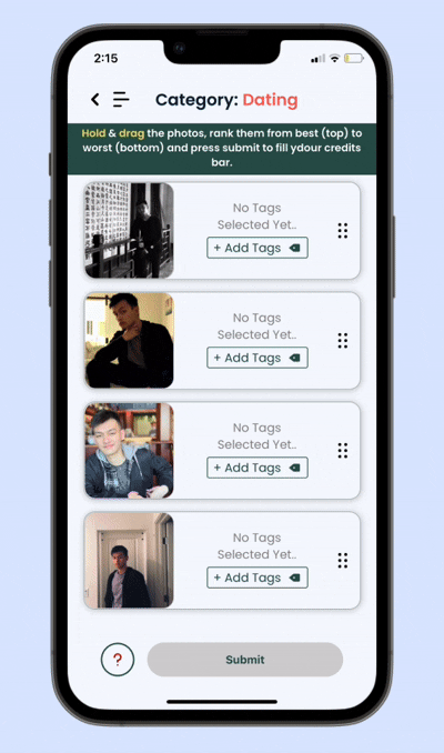
The Current UI makes it hard for users to hold and drag which is a main feature of this app.
The Goal

Easy Onboarding
Help users get through the first flow with ease so users quickly understand how the app works
Color Hierarchy
Use color to give the app more hierarchy and brightness to help users navigate with ease
Gamification
Design a fun and playful experience through simplifying the app

Increase, Reach & Retain
Increase number of downloads, reach a wider audience and retain more users
Solution
Redesign RankPic to be more user friendly and exciting to use by:
Creating a more familiar onboarding experience. Using popular design patterns, I created an experience that users could feel attuned to.
Organizing photo ranking statistics to be at-a-glance. Users can quickly view their most popular ranked photo with any friendly feedback that can help users understand why some of their photos are better or worse than others.
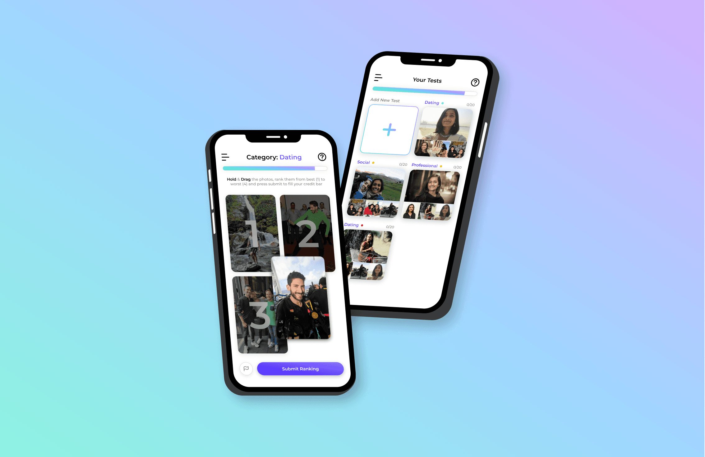
Focusing attention to the photos on the Rank Pics tab. Cleaning up the user interface of the photo ranking page can help users clearly view, enlarge, and rank photos.


Fluid Account Set-Up
Before, the onboarding experience was a common fall-off point because users didn’t understand why the app needed certain information. By implementing popular design patterns, the onboarding experience now feels more familiar and easy to follow.
Precise Test Stats
Your photo tests are now redesigned with a cleaner, more organized look. Users can quickly view their most popular ranked photo with any friendly feedback that can help users understand why some of their photos are better or worse than others.


Easy Photo-Ranking
RankPic now has a cleaner photo-ranking interface that draws the photos to larger, unobstructed photos that are ready to be ranked. Users can focus their attention on viewing, enlarging and ranking others photos.
Learning From the Competitors
I researched two other photo-ranking platforms, Testframe and Photofeeler, to understand their strengths and weaknesses so that I can design RankPic to stand out. Both Testframe and Photofeeler had credit systems that encourage users to rank other users’ photos, however they both felt overly complex and made ranking photos feel like work.
The client and I wanted the app to feel fun and playful like a game so I looked at Tinder and Hinge’s gamified design patterns with the thought of applying some of their photo-swiping and photo layout design patterns to RankPic.

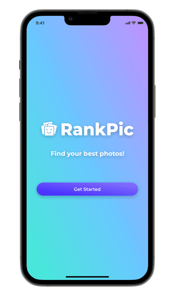
Rebranding RankPic
I worked with the client to flesh out the tone and voice that we wanted to present. We wanted the new design to portray something fun and trendy.
First, I created multiple logo options that referenced photography icons, camera lenses and portrait photography. I played with the concept of stacking and hierarchy. Below are some initial logo designs:
A select few logo designs were shown to 22 different people and the top contender, as well as the client’s favorite, was the final logo below:
A New Visual Identity
Color
I tested out a few color pallets for RankPic. We wanted to use brighter, trendier colors that could cater to a younger crowd. Below are a few color pallets were tested before landing on the final visual design scheme.

Visual Design
Ultimately, we decided on the color scheme shown below. I designed components and UI elements to maintain a unified design voice throughout the app. I set up the components to make them easily accessible so that the client or any other future designers can easily reuse and update the product later on.

Testing User Interfaces & Flows
Redesigning the Onboarding Flow
This guided tour of RankPic for new users is a critical first impression. The client mentioned that many new users would fall off from using the app during this onboarding flow. The goal was to create a more user-friendly experience that felt intuitive while referencing common user interface patterns seen in other common gamified app designs.
Original Design and Flow
Low-Fidelity Flow

High-Fidelity Flow

Redesigning Photo Ranking Layout
This guided tour of RankPic for new users is a critical first impression. The client mentioned that many new users would fall off from using the app during this onboarding flow. The goal was to create a more user-friendly experience that felt intuitive while referencing common user interface patterns seen in other common gamified app designs.
Below are some low fidelity photo ranking layout iterations before the client and I settled on the final design. We chose the final design because it maximizes each photo size, is responsive to different device screen sizes, and proved to be the most intuitive layout according to user testing.
Low-Fidelity Photo Ranking Layout Iterations
High-Fidelity Photo Ranking Old & New Layout Designs

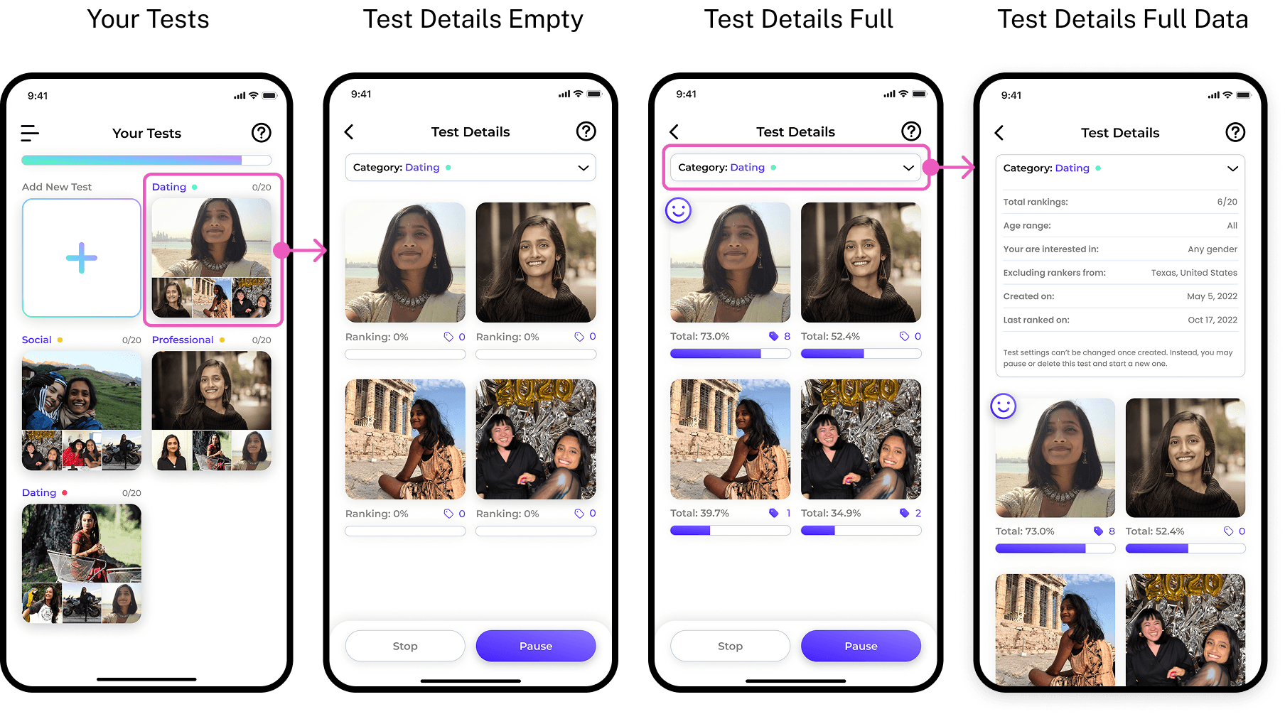
Redesigning Test Details
The Test Details page is where users come to see their tests once they’ve been crowdsourced and ranked. This page was redesigned with a cleaner, more organized look so that users can quickly visualize which of their photos did the best. I also designed the “Your Test” page to cluster all four photos that would be ranked so that users could keep track of which test is which.
Original Design and Flow

Low-Fidelity Flow

High-Fidelity Flow
Final Prototype

The wireframes were further refined into a high-fidelity prototype made with users of varying design skill-levels in mind.
Next Steps
The RankPic app has been updated with the redesign for over two years. Since then, we’ve seen a significant increase in downloads and consistent active users. Moving forward, we are now working on designing a few new monetizing features that will be implemented soon! These features will help you data organize all of the tests you’ve created, allow you to unlock ways to test more photos at once as well and skip the act of ranking others’ photos for credits.